What's new
Off Topix: Embrace the Unexpected in Every Discussion

Off Topix is a well established general discussion forum that originally opened to the public way back in 2009! We provide a laid back atmosphere and our members are down to earth. We have a ton of content and fresh stuff is constantly being added. We cover all sorts of topics, so there's bound to be something inside to pique your interest. We welcome anyone and everyone to register & become a member of our awesome community.

Opinions on a poster?

What's your opinion?

  • Looks perfect.

    Votes: 0 0.0%

  • Total voters
    2

James

Off Topix Veteran
Member
Joined
Apr 18, 2010
Posts
667
Reaction score
1
Points
1,255
I'm making a poster to advertise my novel at my college and I want some opinions on it.

posterredo_zps314881fa.png


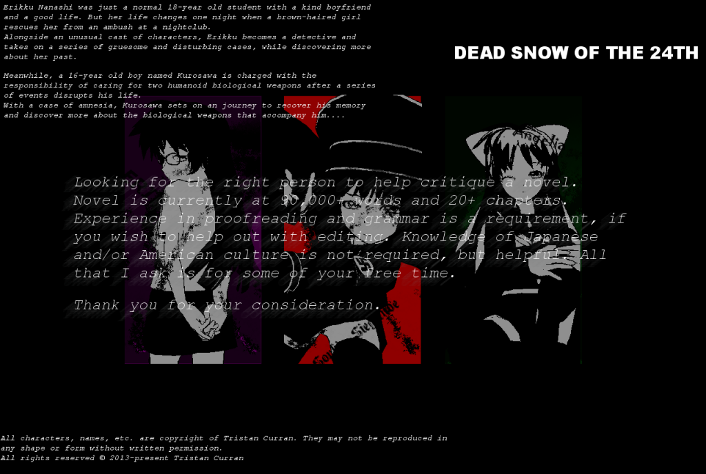
If there are any changes that should be made to it, then let me know. I've still got the .xcf file(It's a file extension in GIMP, which functions like Photoshop's .PSD file extension. It basically allows me to edit my image.)

(Yes, I guess everyone knows my name now.)
 
I think you should improve the contrast on that text covering the images some.
Also... did you check your school's stance on swastikas? I could imagine it being taken down because of it.
 
No, but I might be able to check sometime tomorrow, when I have my class on Physical Networking.
 
The text at the top (and at the bottom) is somewhat hard to read. If you're keeping the poster that size, people will struggle. However, if you upscale it the images will become pixelated. The comma after the word characters on the bottom needs a space after it, and there's some word jumbling with "may be not reproduced" (should be "may not be reproduced").

The text across the middle of the image is hard to read in places due to sharing similar colouring to the image itself, and the blurring looks strange. The art is nice, but the middle one looks slightly out of place.

Edit: Regarding the swastika issue, if you're able to, editing the image would be the easiest thing to do. Reverse it and you have the Sauwastika, a symbol of light and health. In fact, the Swastika was only adopted by Adolf Hitler as a Nazi motif, whereas it had existed hundreds of years before in Buddhism.
 
Updated it a bit and fixed problems with the text. The middle image doesn't look out of place anymore. The .xcf file is only letting go as far as changing the text, so I can't change the actual art.
 

Create an account or login to post a reply

You must be a member in order to post a reply

Create an account

Create an account here on Off Topix. It's quick & easy!

Log in

Already have an account? Log in here.

Back
Top Bottom