What's New
Off Topix: Embrace the Unexpected in Every Discussion

Off Topix is a well established general discussion forum that originally opened to the public way back in 2009! We provide a laid back atmosphere and our members are down to earth. We have a ton of content and fresh stuff is constantly being added. We cover all sorts of topics, so there's bound to be something inside to pique your interest. We welcome anyone and everyone to register & become a member of our awesome community.

Photomanipulations

Caligo

Active Member
Member
Joined
Oct 12, 2009
Posts
102
OT Bucks
1,030
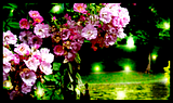
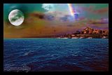
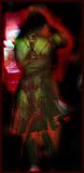
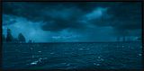
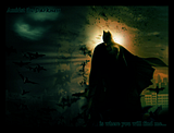
I've either created these from scratch or combining multiple photos together or altering them (such as people--eye colour, hair colour etc). Please let me know what you think.
smile.png
Some of the original photos belong to me, others I found off of Google. Click to see the larger image.


They all look great. The colors used in the second one were AMAZING. You have some skills here. Keep up the great work. ^^
 
The first one has some interesting lighting, it really pops. And the Batman one looks so realistic, for a Batman photomanip. Text could do with some working on, perhaps. Great stuff! I'm awful with photomanips, all my sigs involve either heavy smudging or renders that other people have made.


Chibiwolf said:
They all look great. The colors used in the second one were AMAZING. You have some skills here. Keep up the great work. ^^


happy.gif
I'm really glad you like them Chibi! The second one is a combination of three pictures, and I too love the colours in it.
smile.png
Thanks for the compliment too!
wub.gif


Nebulous said:
Nice work there. Thanks for sharing those with us.
clap.gif


Thanks a bunch Nebulous! I was happy to share some with you guys.
biggrin.gif


Kaczynski said:
The first one has some interesting lighting, it really pops. And the Batman one looks so realistic, for a Batman photomanip. Text could do with some working on, perhaps. Great stuff! I'm awful with photomanips, all my sigs involve either heavy smudging or renders that other people have made.


The Batman one was a wallpaper I made for my boyfriend. He asked me to make him a new myspace background some time ago, and since he loves superheroes. ^^ I think I used the promo pictures for The Dark Knight, so I think there are three pieces combined in it. Would you mind explaining how the text could be better? Do you think the outline should be a different colour or something? I'm really glad you like it!
smile.png


Princess said:
More great work.
clap.gif


I think my favorite is the purple.....


Haha, thanks so much! :3 The purple one I made from scratch a couple years ago. I was going for a space feel I think. Do you get anything out of it?
biggrin.gif


It looks sort of out of place, but the colours are nice, the words are legible which is really good.
biggrin.gif
 
Kaczynski said:
It looks sort of out of place, but the colours are nice, the words are legible which is really good.
biggrin.gif


I see what you mean. Thanks for sharing!
smile.png
 
Back
Top Bottom